Capstone project for UX Professional Diploma

Roles: UX Researcher/Designer
Timeline: March – June 2021
Davidair

(Fictional airline)
Objective
Design a flight booking experience that is straightforward, intuitive, and considerate—based on a deep understanding of the target users.
Project Overview
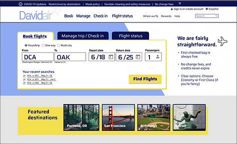
As part of my coursework with the UX Design Institute, I designed a website for a fictional airline start-up, focusing on the primary use case of booking a flight—how the user searches for, selects, and purchases flights. I designed for desktop. It’s true that mobile is “eating the world” (Benedict Evans), but for the high-stakes task of booking flights, most people are still waiting until they are at their desktop computers (Forbes).
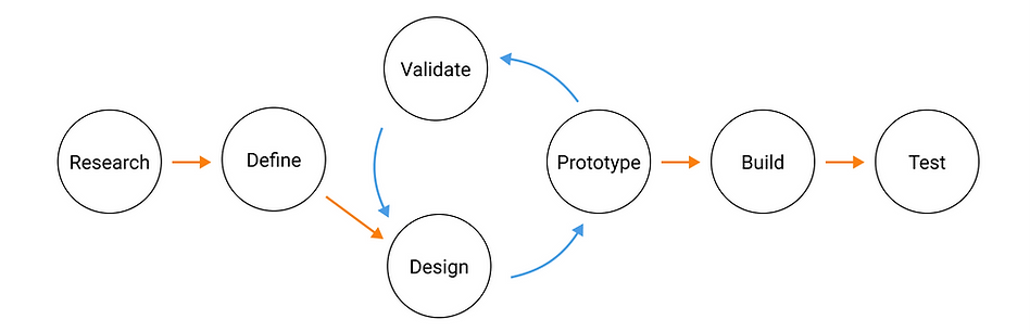
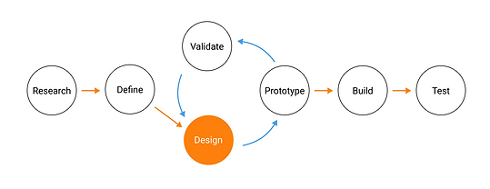
I followed a user-centered design workflow.
Research
UX is about researching the users to understand their perspectives—their goals, pain points, and lived experiences. These insights inform every step of the design process.
If you skip research, you end up designing for yourself, based on your own assumptions and biases. It’s all too easy to do. (Repeat the UX mantra: “I am not the user.”)
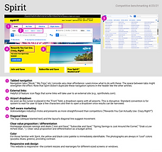
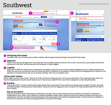
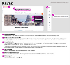
Competitive benchmarking
My first research task was to study competing airlines’ websites to learn from what they do well or poorly. I also identified some of the standard conventions I would have to follow to ensure that my site feels familiar—even for first-time visitors—and minimizes "user friction." I don't want the user to have to learn new rules. (Steve Krug's principle: "Don't make me think.") Besides, good design is invisible.
Click here to view competitive benchmarking slides
(Opens in a new tab)

Online survey
I created a short online survey and collected responses from 15 individuals to get background on potential customers' travel habits. I asked about their most recent visit to an airline website or app. Why did they visit? What were they trying to do or learn? Did they encounter any obstacles? Would they want to change anything about the experience?
Writing a good survey—one that yields unbiased, valid results—is deceptively hard! (For example: Looking back, instead of starting a question "Do you ever...", which might be read loosely as "Would you ever, hypothetically...", I could have phrased it "When was the last time you..." or, "In the last six months, how many times have you...") We humans are surprisingly bad at predicting what we usually do or might do in the future. Asking about concrete things that people actually did do recently is a more reliable approach.
User interviews and usability tests
What people say they do and what they actually do are often two very different things. That’s where the usability test comes in. In a usability test, you observe people using the product and get them to think out loud as they complete a task. It sounds simple, but it is the most powerful tool in the UX toolkit.
I didn't have any of my own designs to test yet, but I could still learn from usability tests of competitors' sites. To start, I took notes on a few pre-recorded usability tests. These tests highlighted issues with Aer Lingus's booking process. For example, on the flight selection page, a user initially mistook the arrival time for the departure time, because the departure time (most relevant) was on the periphery, whereas the arrival time was centered on screen where her eyes were already tracking. (See screenshot, below.) I also conducted my own usability tests, presenting a test user with a flight booking task on Southwest and United.

Saver? Plus? Advantage?
"Oh right...This is where they getcha."


Images from UX Design Institute
On pop-ups and ads:
"I have to continually be reminded that I'm just a consumer and they just want to advertise at me."
"Baggage and optional fees? I hope it opens a new tab...NOPE. it takes you entirely away. I find that very annoying. (Laughs.) It just took me out of the whole process I was just doing...to look at, ya know, optional travel charges—which is an insulting term."
"This just really feels like what I'm doing is secondary to the credit card they're trying to sell me. (Laughs). I've got this teeny little box which sums up my information and then this big advertisement...[Their] priority is clear."
"Bundle option 1. Bundle option 2. They're just trying to get me to change what I've already chosen...in order to have me spend more money. It's really obvious. But I've already made my choice. That's why I chose it."
Define the problems
Affinity diagram

Now the messy part. At this point I had a lot of unstructured data and needed to organize it somehow and distill the key findings. Time to break out the sticky notes for an affinity diagram.
This is best done in collaboration with others. First, your team reviews the research, and as you comb through it, each participant picks out important tidbits or user quotes and writes each one down on its own sticky note. This part is done in silence so that no one single viewpoint or personality dominates. Then you come together and put all the sticky notes on the wall and sort them (usually with some trial and error and lively conversation) until you land on meaningful, right-sized groupings.
Problem solving
Now some patterns emerged. I also started to come up with possible solutions to test.
Calendar date pickers are clumsy. See clip from usability test.
Users are distrustful of airlines and are on the lookout for 'gotchas' and hidden fees. And it’s hard to interpret and trace the price. (Is this roundtrip? Per person? After taxes and fees? Why does the price look different on this page?)
Users resent ads and persistent upselling, especially when it gets in the way of their task or second-guesses them
Users can go “down the rabbit hole” investigating fine print on fare terms and exclusions
Try using two, clearly separate date picker fields—one for departing date and one for returning date—to avoid confusion over current mode.
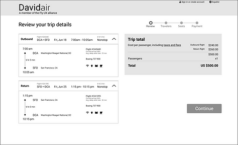
Try being consistent in presentation of the cost. When the departing flight and returning flight are priced individually, the user is keeping track of the two dollar amounts in her head to estimate her total. On the next page, under "Total Cost," she should be able to instantly recognize these two numbers so she can be assured that no extra fees were slipped in.
Davidair doesn't have ads currently. When we do, they will need to be placed strategically (maybe on homepage and confirmation page only) so that they don't obstruct the user's flow.
Things don't have to be this way!
Travel classes (e.g., “Saver,” “Plus,” “Advantage”) are a universal convention, but the specifics are often confusing and require that the user do work
Try using just two simple travel classes. Everyone knows immediately if they belong in First Class or Economy. ("If you have to ask, you can't afford it.") This also means the user isn't teased with grayed-out ("sold out") fare types, and it means no more stressful (and dubious) "Only 2 seats left at this price!" warnings. Finally, the two classes map to the mental model people have of the plane itself—there are really only two qualitatively different sections of the cabin on most passenger planes.
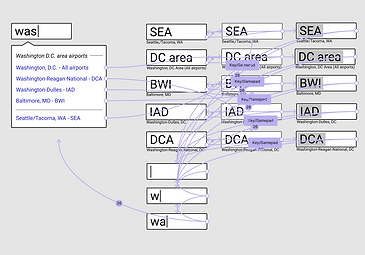
User Journey Map
Click here to view user journey map
(Opens in new tab)

Here I put even more structure on the analysis of my research data, organizing the data points sequentially and overlaying them on a high-level map of the user’s steps in the booking process. This allowed me to visualize ups and downs in the user’s mood or “reservoir of goodwill” for the site. The mood assessments are not scientific. I created a patchwork user, and there is a high level of subjectivity involved. Still, placing the data points in sequential order and in some context is a helpful exercise. The timing matters. A pop-up message might be a minor inconvenience in one moment, and in another, the same pop-up is the straw that breaks the camel's back (or causes the camel to abandon the flight booking process).
With this wider view of the booking process, I began to pick out the highest-priority interventions. For example, I figured that the lowest low might be when the user notices a glitch with the prices: She selects a departing flight where she is told the roundtrip cost is $473. Then on the next page, for a return flight, there actually isn't a single option that keeps the roundtrip price at $473. All the options result in a higher cost. This comes at a time when the user is already under heavy cognitive load. She just analyzed the differences between "Basic Economy" and "Economy," and she is also holding a lot of data (dates, departure time, duration, cost, etc.) in short-term memory as this page loads. Now she runs into this setback and feels a loss of agency.
For Davidair, I homed in on pricing transparency/consistency as a top priority.
Design solutions
User Flow Diagram
Only now—already a few months in—was I ready to start actually designing, beginning with a flow chart of the screens and screen states involved in the booking process.


Click here to view user flow diagram
(Opens in new tab)
Sketches
Next I sketched each of the key screens and screen states on paper. Then I put the sketches in front of users.


Prototype

Interactive prototype
I used the web app Figma to build an interactive, medium-fidelity prototype of the complete booking process. I taught myself Figma and built the first iteration of the prototype in just 8 days (and around my full-time job!) in order to meet an early grading deadline. Very little sleep happened.
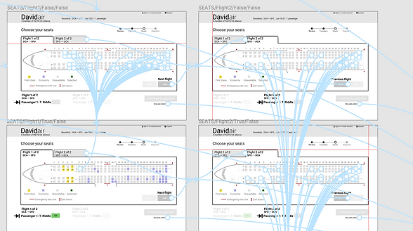
Watch the prototype in action
Or click here to interact with the prototype
(Opens in new tab)
Validate (or invalidate)
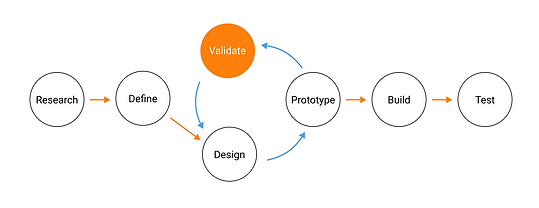
Usability tests

I ran some usability tests with my prototype. There were definitely some kinks to work out. But I was able to validate the high-level user flow.
Build
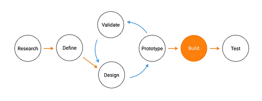
Detailed wireframes
This document contains most of the information the developer would need to build the flight booking process accurately. I'm not a fan of the terms "handover" or "hand-off." Even if my notes were perfect and complete, I wouldn't dust my hands together and go home now. I would want to be in regular conversation/collaboration with the developer, keeping eyes on the process.
(Opens in new tab)

Reflection
(You're still reading? Wow. Thank you for hanging in there!)
The prompt from the UX Design Institute was to design a flight booking process that is "fast, easy and intuitive: one that’s based on a deep understanding of their target users."
Over time, I came to realize that "fast, easy and intuitive" is just a start—like the basic needs in Maslow's hierarchy of needs. Once these basic needs are met, energy can be devoted to higher-level considerations. In the case of an airline website, the higher-level might be the feelings of distrust people feel towards airlines. Users have a lot of emotional "baggage," so to speak, and for the usability test participants I saw this color their interactions with the website.
In my case study, I at least scratched the surface of this higher level. I took a page out of Alan Cooper's book, adopting his design principle that "software should behave like a considerate human being." A lot of the standard airline practices (like not being forthcoming about the costs of add-ons, inconsistent pricing info, and intrusive advertisements) are clearly inconsiderate. Things don't have to be this way! For Davidair, I added "considerate" to my definition of success for the product.
The airline can be profit maximizing and at the same time offer a great user experience. These aren't at odds with each other. It just requires a more thoughtful approach.